

October 6, 2026

12
min read
6mm Tap Targets: Standards Led Mobile Survey Design for Insight Teams
Learn how to design better mobile surveys, from touch targets and question types to accessibility, load times and usability testing.

Learn how to design better mobile surveys, from touch targets and question types to accessibility, load times and usability testing.

Design for the smallest screen first, make every control easy to tap, and keep the whole experience short. These three rules decide whether a mobile respondent finishes a survey or abandons it: aim for a touch target of around 6 millimetres or larger, and keep a mobile-first questionnaire to roughly 15 minutes or less wherever the subject allows it.
Single-choice and short multiple-choice questions presented in a vertical list are the safest format on a phone screen. They scale cleanly, need no horizontal scrolling and match how respondents already interact with mobile apps. Wide grids and traditional matrix tables cause the opposite problem: squeezed columns, tiny labels and a high risk of a respondent tapping the wrong row.
Where a grid is unavoidable, break it into something a thumb can manage:
Sliders, drag-and-drop ranking and long open-text boxes all belong on the “avoid” list. Sliders are hard to position precisely with a fingertip and can misrecord a value if the thumb slips. Drag-and-drop ranking often fails outright on touchscreens and blocks assistive technology entirely. Long free-text fields invite short, low-quality answers because typing on a phone keyboard is slow and tiring. Replace sliders with discrete scale buttons, replace drag-and-drop ranking with a sequence of “pick your top choice” screens, and replace long open text with a shorter prompt or a closed list with an “other, please specify” option.
The research on scrolling versus paging shows a genuine trade-off rather than a single winner. Scrolling through several questions on one long page tends to be faster to complete, but it can raise item non-response because questions lower down the page are easier to skip without noticing. Paging, where each screen carries one question, keeps attention focused but adds a small amount of perceived effort because respondents tap “next” more often.
For most mobile-first instruments, one question per screen is the safer default. It keeps the respondent’s attention on a single decision, avoids the scanning behaviour that leads to skipped items, and lets a progress indicator do useful work without overstating how much is left.
A few layout habits make this default work in practice:
Most mobile data-quality problems trace back to something physical: a button too small for a fingertip, two options too close together, or a keyboard that forces a respondent to hunt for the right key. The Census Bureau’s proposed standards for mobile survey instruments set out 30 guidelines covering exactly this, including a recommended minimum touch-target size of around 6 millimetres. Larger radio buttons and checkboxes at roughly this size reduce missed taps, cut completion time and improve respondent satisfaction compared with the small radio buttons many legacy survey platforms still use by default.
A short set of practical rules follows from that evidence:
Pro Tip: If you can only fix one thing before fielding, widen the tap area around each answer option first; it tends to produce the largest drop in accidental mis-taps for the least design effort.
Short, single-idea question stems read faster and survive translation to a small screen far better than multi-part or memory-heavy questions. A stem that asks a respondent to hold two conditions in mind before answering is a stem that will generate noise on a phone, where there’s no space to re-read the full question alongside the answer options.
Typography matters as much as wording. Guidance from the mobile survey standards work recommends a readable base font size, a bold question stem to separate it visually from supporting text, and italicised instructions so respondents can distinguish “what to do” from “what’s being asked”. Contrast between text and background needs to stay high enough to read in bright daylight, not just indoors.
A mobile survey that excludes respondents using assistive technology isn’t simply less inclusive, it’s producing a biased sample. MRS guidance on mobile optimisation treats accessibility as integral to good mobile design rather than a separate checklist, which means avoiding interactive elements such as unlabelled sliders and drag-and-drop ranking that block screen readers outright, and building keyboard-navigable alternatives for every interaction.
A touch target around 6 millimetres is the baseline the Census Bureau’s proposed mobile standards recommend for reducing missed taps and improving completion for all respondents, not only those using assistive technology.
Practical checks that catch most problems before launch:
Design choices that look reasonable on a desktop monitor often behave differently in a respondent’s hand, which is why usability and cognitive testing earn their place in the schedule rather than being treated as optional polish. The DfE and Ipsos MORI mode trial that developed a mobile-first parent survey found usability testing essential to getting the design right, trialling conventions such as one question per screen, avoiding open text, and comparing 15-minute against 20-minute versions of the same instrument.
A workable test plan doesn’t need a large sample to be informative:
Before fielding, run through a short do and don’t list:
A quick pilot protocol: test on at least three device types (a small-screen phone, a larger phone, a tablet), collect completion time, break-off rate and touch-success data from each, and treat any option with a break-off rate noticeably higher than the survey average as a candidate for redesign.
Pro Tip: Removing a redundant answer option or widening a button often fixes more break-offs than a full visual redesign, so try the cheap fix before the expensive one.
We build questionnaires with a human-led, AI-disciplined approach: modern scripting tools and AI-assisted checks speed up the build, but every instrument still goes through judgement-led review before it reaches a respondent. That combination covers questionnaire design, remote usability testing and mixed-mode protocols for clients who need their data to hold up across device types and markets.
A short, non-identifying example: redesigning a client instrument from a desktop-style matrix to an item-by-item mobile layout cut the break-off rate on the affected section noticeably, simply by removing the need to scroll a wide table on a small screen. We treat this kind of fix as routine rather than exceptional because it tends to be where most mobile data-quality problems live.
Autocorrect is a frequent, under-noticed source of bad open-text data: a phone keyboard will happily “fix” a brand name, a postcode fragment or a technical term into something plausible but wrong. The simplest defence is to avoid open text wherever a closed list or a short, specific prompt will capture the same information, and to disable autocorrect and autocapitalise on fields where it’s known to cause problems, such as names, codes and identifiers.
Numeric entry deserves its own attention. Triggering a numeric keypad for any quantity, age or monetary figure removes the chance of a stray letter breaking validation, and it’s faster for the respondent than hunting across a full keyboard. Setting sensible range checks, for example rejecting an age of 300, catches fat-finger errors at the point of entry rather than during cleaning.
A few further habits reduce error rates without adding friction:
A survey that loads quickly on office wifi can stall badly on a patchy mobile signal, and every extra second before the first question appears raises the chance of abandonment before the respondent has answered anything. Image-heavy question stimuli, embedded video and unnecessarily large page scripts are the usual culprits.
Compressing images before upload, loading only the assets a given screen actually needs, and avoiding auto-playing video unless it’s essential to the question all help keep page weight down. Where a visual stimulus is unavoidable, such as in concept or ad testing, offering a lower-resolution version as the default and a “view full quality” option respects respondents on a weaker connection without sacrificing the researcher’s need for a clear image.
Testing load time across a deliberately throttled connection, not just a strong wifi signal, during the pilot stage catches problems that desk-based testing misses. A survey platform that caches progress locally and resubmits automatically once connectivity returns also protects against lost responses on an unreliable network, which matters most for fieldwork conducted outdoors or in transit.
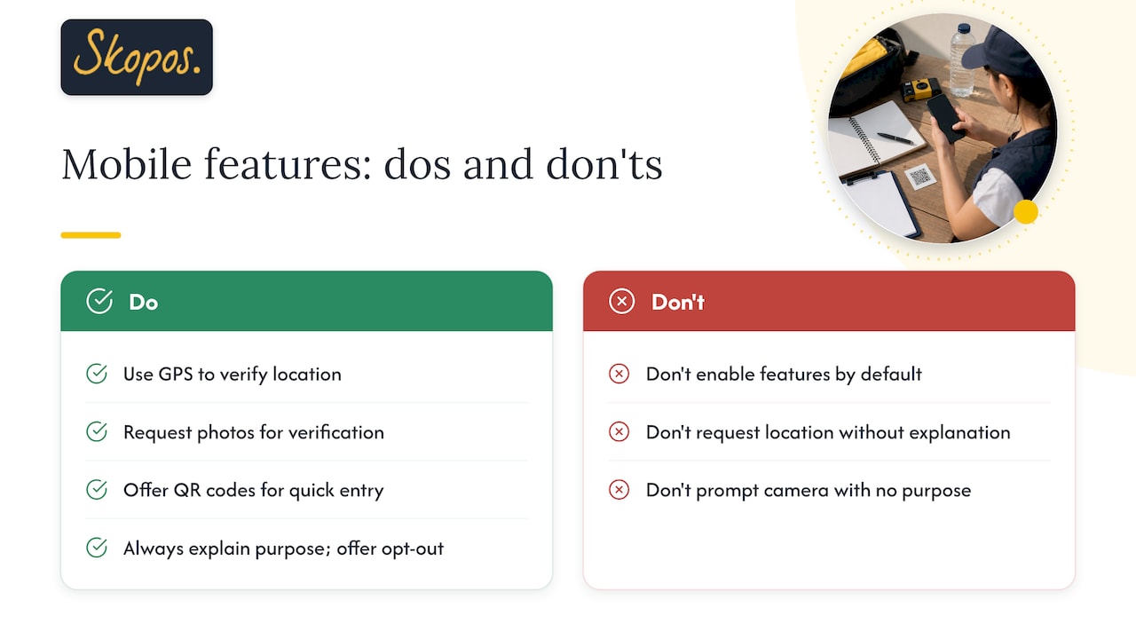
A phone carries capabilities a desktop survey never had access to, and some of them genuinely improve data quality rather than just adding novelty. GPS location can confirm or supplement a respondent’s reported location for geographically sensitive studies, removing the need to ask a question that respondents might answer imprecisely from memory. Camera integration lets a respondent photograph a receipt, a product on shelf or a packaging detail rather than describing it in open text, which tends to produce cleaner, more verifiable data for studies such as pricing audits or in-store experience research.
These features need the same discipline applied to every other design choice: use them only where they serve a specific research question, always with clear consent and an opt-out, and never as a default simply because the device supports it. A location request that isn’t explained, or a camera prompt with no clear purpose, tends to raise suspicion and increase break-off rather than improve the response.
QR codes sit in a related category: used well, they offer a fast route from a physical touchpoint into a mobile survey, and guidance on QR code sizing for feedback is worth following closely, since a code that’s too small or poorly placed defeats the purpose entirely.
Sometimes the better mobile design isn’t the right choice: a tracking study that has run the same grid for years may need to protect comparability over usability. Pilot both versions and document any mode effect before switching.
Getting questionnaire design, usability testing and mixed-mode protocols right takes a mix of standards knowledge and field judgement that’s hard to build from scratch for a single project. We offer a combination of questionnaire scripting built around mobile-first conventions, remote usability testing with respondents on various devices, mixed-mode design including browser fallbacks alongside apps, and data quality audits to identify break-off patterns before they impact live studies.
If your next study needs to perform well on a phone screen as much as a laptop one, our Insight Partner plans, Foundation, Growth and Strategic, give you a direct route to that support, with pricing available from the plan page.
A touch target of around 6 millimetres is the widely cited baseline from the Census Bureau’s proposed mobile survey standards. Targets at or above this size reduce missed taps and tend to improve completion rates compared with smaller radio buttons or checkboxes.
Mobile-first instruments generally work best at around 15 to 20 minutes or less, since attention and patience on a small screen drop faster than on desktop. Trimming non-essential questions and avoiding long open-text fields is usually more effective than cutting whole sections.
Both have trade-offs: scrolling tends to be faster but can raise item non-response, while one question per screen keeps focus but adds a small amount of perceived effort per question. One question per screen is the safer default for most mobile-first instruments, particularly where data completeness matters more than speed.
Sliders are difficult to position precisely with a fingertip and can misrecord a value if the thumb slips, while drag-and-drop ranking often fails on touchscreens entirely and can block assistive technology. Discrete scale buttons and sequential ranking screens generally capture the same information more reliably.
A simple comparison with around 20 or more participants per condition, measuring touch success, completion time, break-off rate and item non-response, gives a practical read on which design performs better. Offering a browser-based fallback alongside an app version can also increase participation and reduce selection bias during testing.