

August 25, 2026

14
min read
Data quality in surveys: what researchers must audit and fix
Learn how to improve survey data quality using Total Survey Error, pre-field QC, paradata, fraud checks and transparent reporting.

Learn how to improve survey data quality using Total Survey Error, pre-field QC, paradata, fraud checks and transparent reporting.

Data quality in surveys means the extent to which a dataset is fit for its intended use once every error source in the Total Survey Error (TSE) framework, coverage, sampling, nonresponse, measurement and processing, has been accounted for. Two standards worth knowing before anything else: AAPOR’s disclosure guidance and GESIS’s Survey Quality Predictor (SQP), which scores measurement risk before a single response comes in.
Here’s the uncomfortable context: close to 50% of published articles using online surveys report no procedure at all for evaluating the quality of the data behind their conclusions.
Three things to do before reading further:
Reliable survey data comes from pre-registering quality rules against the Total Survey Error framework, not from cleaning up problems after fieldwork ends.
Most researchers still ask “is this survey any good?” as if quality were one number. It isn’t. The Total Survey Error paradigm treats quality as a judgement about fitness for use, built from several distinct error sources that behave independently. A survey can have a superb response rate and still be measuring the wrong thing entirely.
Map your checks against the five components and the gaps become obvious fast:
A single design flaw, say, recruiting through a Facebook ad, shows up in every one of these boxes at once. It skews coverage (only Facebook users are reachable), skews sampling (algorithmic ad delivery favours certain demographics), inflates nonresponse bias risk, and can even distort measurement if the recruited group interprets questions differently from your target population. Judging fitness for use means asking whether that combined distortion still lets you answer your actual research question, not whether any single metric looks acceptable in isolation.
Measurement error is the one TSE component researchers most often skip, because it requires slowing down before fieldwork rather than cleaning up after it. Get the checklist right and you avoid rebuilding trust in results later:
SQP scores individual survey items on expected reliability, validity and method effects before you field a single response, using characteristics of the question’s wording, response scale and context that its underlying meta-analysis links to measurement error. Feed it your draft items during questionnaire development and it flags which questions are likely to underperform, letting you fix wording before the cost of a bad question compounds across a full sample. GESIS maintains it as a free tool, and it’s particularly valuable when you’re running the same instrument across multiple countries, where subtle translation drift can quietly break comparability across markets.
Watch for the usual culprits: double-barrelled items asking two things at once, jargon that means one thing to researchers and nothing to respondents, and order effects where earlier questions prime later answers. Cheap diagnostics catch most of this after the fact: item non-response rates that spike on a specific question, unusually low variance suggesting respondents didn’t engage with the scale, and item-total correlations that reveal a question isn’t measuring what the rest of the battery measures.

Pro Tip: If you’re choosing between a bigger pilot sample and more cognitive interviews, pick the interviews first. A pilot with 200 completes tells you a question performs badly; five cognitive interviews tell you why, and only the second gets you to a fix.
A response rate on its own tells you almost nothing about whether your sample represents the population you care about. Run these checks before you trust the topline numbers:
Four metrics are worth computing and reporting every time: frame coverage (the proportion of your target population that could theoretically be reached through your frame), response or participation rate (completes divided by eligible contacts), cooperation rate (completes divided by all contacts who engaged at all), and completion rate (finished surveys divided by started ones). None of these numbers is inherently good or bad. A 15% response rate from a well-matched frame can outperform a 40% response rate from a skewed one.
Spotting nonresponse bias doesn’t require sophisticated modelling. Cross-tab your achieved sample against two or three variables you can benchmark externally, age, region, or a behaviour tracked in official statistics, and see where the gaps sit. If the gaps are structural rather than random, weighting and post-stratification correct for known skew, but they cannot fix a frame that never reached the right people in the first place.
Pro Tip: Longer field periods and larger incentives both tend to raise response rates, but incentives that are too generous relative to the task can attract satisficers chasing the reward rather than engaged respondents. Match incentive size to task length, not to what maximises completes.
Not every problem response is the same problem, and treating them identically wastes effort. A framework for assessing response quality sorts problematic answers into three distinct categories: response styles (consistent tendencies like always picking extreme options), insufficient-effort responding (straight-lining, speeding through without reading), and response manipulation (bots, duplicate submissions, coordinated deception for incentive fraud). Each needs a different diagnostic.
Your practical toolkit:
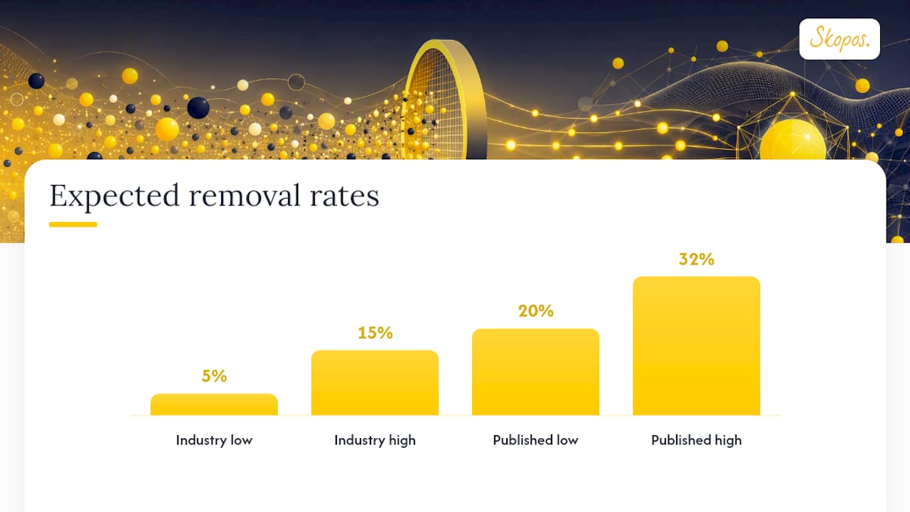
How many responses should you expect to lose? Industry baselines sit around 5% to 15%, though some published cleaning studies report removal rates as high as 20% to 32% depending on platform and topic sensitivity.
The safest decision rule combines indices with an AND condition rather than flagging on any single failed check, which cuts false positives sharply. Never delete flagged records outright: keep them with flags attached, then run your headline analysis both with and without them as a sensitivity check. If the conclusions hold either way, you’ve earned confidence in the finding rather than just in the cleaning.
Pro Tip: Lock every threshold, speeding cut-off, IRV minimum, Mahalanobis critical value, before you look at the outcome data. Setting thresholds after seeing which respondents “look wrong” is how post-hoc bias creeps into supposedly objective cleaning.
Paradata are the digital exhaust of a survey: timestamps, page-by-page timing, break-off points, device and browser type, and geolocation or IP fingerprints, plus whatever metadata your panel vendor supplies about respondent history. Waiting until fieldwork closes to look at any of this wastes the one advantage online surveys have over paper ones: you can watch quality in real time and intervene while there’s still time to fix it.
Three alerts are worth building even in a modest dashboard:
A short implementation checklist keeps this manageable: enable paradata capture at setup, define alert thresholds before launch, review a daily QC dashboard rather than waiting for a weekly report, and agree in advance who has authority to pause a source. In practice, that might mean pausing recruitment from a specific panel supplier the moment speeding rates from that source spike, rather than discovering the damage during post-field cleaning.
Yes, and the differences are large enough to change your entire QC strategy depending on where your sample comes from. The European Social Survey (ESS) remains the closest thing to a methodological exemplar for probability-based, cross-national fieldwork, built around exhaustive documentation and TSE-consistent reporting. That’s the standard to aspire to; it’s rarely the standard commercial fieldwork can fully replicate on commercial timelines and budgets.
Platform-level evidence backs this up directly. A study applying 20 standardised quality checks across three crowdsourcing platforms found good-quality response rates ranging widely across platforms, from low on Amazon Mechanical Turk (MTurk) to relatively high on SurveyMonkey, a sevenfold gap driven largely by vendor-level fraud controls and audience composition rather than anything the researcher did.
Pro Tip: Don’t run the same QC package across every platform. A rule set calibrated for a proprietary panel will under-catch fraud on a crowdsourced sample, and an MTurk-grade screening battery is often overkill, and annoying, for a well-managed panel.
Transparency isn’t a courtesy to readers, it’s the mechanism by which anyone can judge whether your fitness-for-use call was reasonable. AAPOR’s guidance treats disclosure and routine publication of quality metrics as essential, not optional, precisely because errors are only assessable when the procedures behind them are visible.
A publishable quality report should disclose:
A reusable outline follows a simple order: methods, QC steps applied, exclusions by stage, sensitivity analyses run, and limitations. Write cleaning steps as syntax or scripts rather than manual spreadsheet edits, which preserves an auditable trail that anyone can rerun and verify.
Pro Tip: Attach a short machine-readable QC appendix, a table of flags and counts, alongside the narrative report, and keep excluded records rather than deleting them. Auditability is worth far more after publication than it feels like at the time.
Treat quality control as three phases, each with its own actions rather than one generic “clean the data” step tacked on at the end.
Threshold examples worth adopting as defaults: a completion-time floor set relative to your median reading speed for the instrument, and an IRV cut-off calibrated against your pilot data rather than borrowed from an unrelated study. On exclusion rates, hold the same benchmark from earlier in mind: 5% to 15% is typical, and rates above 20% to 32% usually mean the questionnaire, not the respondent pool, needs a second look.
A typical Skopos survey moves through the same TSE-consistent sequence this guide describes: objective setting and questionnaire design, a pilot with cognitive checks, live fieldwork with paradata monitoring switched on, structured post-field QC, and a transparent debrief that shows the client exactly what was excluded and why.
Each stage maps to something the client actually receives:
Pro Tip: Agree the QC plan, thresholds and all, with the client before fieldwork opens, not after seeing the results. It turns “why did you exclude these responses?” from an awkward post-hoc justification into a decision everyone already signed off on.
Every quality rule in this guide sounds clean on paper. In practice, you are usually choosing between two imperfect options under time pressure, and the honest answer is that neither rigour nor speed wins every time.
Favour conservative exclusion rules when the decision riding on the data is high-stakes and hard to reverse, a pricing decision, a market-entry call, anything a client will act on immediately. Favour a lighter touch with heavier sensitivity reporting when the sample is already small or hard to replace, and losing another 15% of it would leave you with too little to say anything useful at all.
What I’d push back on is the instinct to treat exclusion rate as a badge of rigour. The better discipline is documenting the trade-off explicitly and discussing it with stakeholders before fieldwork, not defending it after the fact. Clients respect a pre-agreed threshold far more than a post-hoc explanation, however statistically sound that explanation is.
If you’re weighing up whether to build this QC infrastructure in house or bring in a partner who already runs it on every project, Skopos supports exactly the stages this guide covers: questionnaire design with pretesting, pilot fieldwork, real-time QC monitoring, and the exclusion documentation you need for a defensible quality report.
Skopos works to a data quality excellence pledge that puts TSE-consistent checks and transparent reporting into every project rather than treating them as an optional add-on. Relevant services include:
For readers wanting third-party guidance on converting cleaned data into decisions, Kontrol Media’s guide to informed decision-making is a useful companion read.
If your next project needs this level of rigour built in from the start, get in touch with the Skopos team to scope a questionnaire design and QC plan before you go to field.
Run attention checks, speeding thresholds and straight-lining detection together with an AND rule, then compare your headline result with and without the flagged cases before deciding anything is final.
How much survey data should I expect to exclude?
Does SQP replace the need for pretesting? No. SQP predicts measurement error from question characteristics before fieldwork, but cognitive interviews catch comprehension problems SQP's scoring model can't detect on its own.
Why do MTurk and SurveyMonkey show such different quality rates? Vendor-level fraud controls and audience composition differ sharply between platforms, which is why a study applying identical checks found good-quality rates ranging from roughly one in ten completes to over seven in ten depending on the platform.
What should always go in a survey quality report? Frame and recruitment details, field dates, response and completion rates, every threshold applied, exclusion counts by stage, and the weighting method used, published alongside the results rather than held back.